28 / Consumer app
Soon: Virtual Events
The problem
Plenty of tools helped people find real-world meetups. Far fewer handled the events a lot of people actually plan their evening around: a TV premiere, a livestream, a device pre-order, a Q and A that happens online. Those things have a start time and an audience, but they did not fit neatly into the calendars and event pages people already used.
The founders wanted a social calendar for exactly those events, and they wanted it to feel quick. If adding or finding an event took more than a couple of taps, people would go back to texting a link. We were a small freelance team working to a deadline, so the first version had to be tightly scoped and still make a clear impression on first launch.
A good first version let someone find an event, say yes to it and tell friends in seconds.
Events in Soon could also change. When a livestream moved or a premiere was pushed back, the people subscribed to it had to hear about it. That put notifications at the center of the design: each change to a time, a place or a date had to reach subscribers as news, and the feed had to show at a glance how soon each event started.
The approach
On a small team with a deadline, my first job was to agree on scope with the founders and the product manager. I drew the whole map first, then the rough screens, then the look and the motion.
- 01
Defining the gap
In the first sessions with the product manager and the founders I wrote down what Soon would do that a regular event page did not. We kept landing on the same list: events that can be online or in person, a way to back events you like, and a way to follow the ones you plan to attend. Everything else could wait for later versions.
Three things made the cut for the first release, and everything else was parked for later versions. - 02
The UI map
I drew every screen on one sheet, version 1.0, with a Start here note at the sign up screen. Home, Trending, Friends, Reminders and My Profile sit along the top row. Search, filters and confirmation messages hang off them. A single page showed the team how big the first version was, and what to cut.
Soon UI map, version 1.0. - 03
Gray wireframes
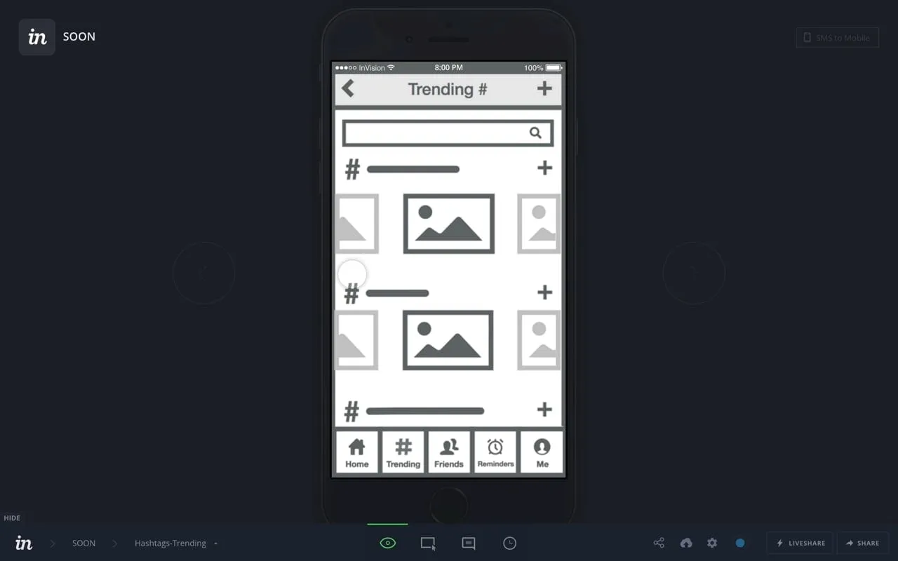
I wireframed the main tabs in flat gray with placeholder images: home as a stack of large event cards, notifications that spell out each change, and an events tab split into Promoted and Subscribed. The notification wording mattered most. A time or location change had to read as news, not as a comment.
Wireframes. - 04
Teaching two actions
Soon had two verbs that people had not seen together before, so onboarding got short walkthrough screens. One says Love it? Promote it! with a pink heart over a card, and the other says Subscribing to Events with a green check. Each color matched the color the action used in the app. Skip stayed on every screen.
Onboarding walkthrough. - 05
The event details screen
The details screen is split into three tabs: Description, Location and Comments. I put the title, a countdown and the poster's name in the header image so the event is clear at a glance. Location gets a map and a Directions field, and Subscribe and Promote stay fixed at the bottom of the screen.
Event details: description, location and comments. - 06
Brand, color and event cards
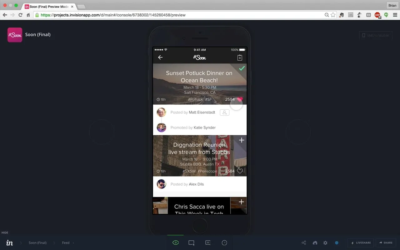
I designed the #Soon logo as a hand-lettered script, then picked bright colors for the cards so a feed would have energy at a glance. The event cards moved: I made animated versions in motion graphics so the founders could show how a card reacts when you promote or subscribe, before it was built.
The home feed.
The solution
Soon is an iOS app where people create events, which can be online or in person, and share them as bright cards. A home feed lists upcoming events with a countdown. People can promote an event they like so friends see it, subscribe to one they plan to attend, follow hashtags, and message each other. Notifications report any change to time, place or date.
The design idea was to turn the two most common choices into one tap each. Promote says this is worth your time, and subscribe says I am going. Everything around them, from the dark feed that lets the bright images stand out to the fixed buttons on the details screen, was built to keep those two taps close.
Decisions along the way
Three things for the first version
Events that can be online or in person, a way to back events you like and a way to follow the ones you plan to attend. Everything else was parked for later versions.
Two verbs, two colors
Promote is a pink heart and subscribe is a green check, in onboarding and in the app alike, so the walkthrough teaches the same marks people will tap later.
Changes read as news
Notifications spell out each change to time, place or date, so a moved event reads as news.
The two actions stay put
On the event details screen, Subscribe and Promote stay fixed at the bottom while the description, location and comments tabs change above them.
What I delivered
- UI map covering every screen, version 1.0
- Wireframes for home, notifications and events
- Onboarding walkthrough and event details screens
- The #Soon logo and bright color system
- Animated event cards and demo videos
See it working
Value added
For people using it
People could find an event, back it and follow it with one tap each. Changes to time or place showed up in notifications, so someone planning to attend would not turn up at the wrong hour.
For the business
The founders had a prototype that looked and moved like a finished app, and a logo and look to match. That gave them something they could show to the press, friends and early users.
For the team
A single UI map and a short list of screens meant the product manager could plan the build with me directly. Working freelance, I kept everything handoff ready.
By the numbers
US adults who own a smartphone
Pew Research Center surveys, the last reading of each year before Soon's launch in March 2017.
View as table
| Period | Value |
|---|---|
| 2011 | 35% (May 2011) |
| 2012 | 45% (December 2012) |
| 2013 | 58% (October 2013) |
| 2014 | 59% (December 2014) |
| 2015 | 69% (November 2015) |
| 2016 | 77% (November 2016) |
Source: Pew Research Center, Mobile fact sheet (opens in a new tab)
The result
The first MVP was designed and prototyped, and TechCrunch covered Soon on March 8, 2017.
What I took from it
With founders, a one-page map of the whole product is the fastest way to make scope decisions, because everyone argues about the same thing. Next time I would put the animated cards in front of them even earlier, since motion changed how they described the app.
Background
Soon launched on the App Store as a free iOS app in March 2017. TechCrunch described it as a side experiment. Users created the events, which could be online or in person, and they appeared as bright animated cards. People could message each other, join group chats and find events through hashtags. It was also featured on Product Hunt the same week. The audience was already on phones. Pew Research Center found that 77 percent of US adults owned a smartphone in November 2016, up from 35 percent in 2011.