27 / Fintech
Lend-a-Friend
The problem
Lend-a-Friend is a friend-to-friend (F2F) social lending app for Central and South America. People borrow money from friends inside a trusted social network and pay it back on a low, pre-negotiated payment and interest schedule. The founders had the idea and the partners, including Dwolla for payment processing and risk management, but they had nothing to show yet.
Money between friends is awkward. Asking for it is personal, and the terms are often vague, which is how people end up resentful. The app had to make a request feel as easy as a text message and still spell out the amount, the schedule and the rate. It also had to look trustworthy enough that someone would put real money behind it.
Under the friendly surface sat a payment system. Dwolla handled processing and risk management, which meant money in transit and requests for identity documents had to appear in the app as states a borrower could understand. The design had to make those states plain without turning the app into a bank form.
The approach
Working directly with the founders, I set the work up so decisions got made in the room: a live working session first, then one map of the whole product that everyone could point at.
- 01
A four-hour working session
We started with a four-hour online working session. I built the first conceptual prototype while the founders watched and reacted. They could say no to a screen in thirty seconds, and I could change it before we moved on. By the end, the core loan idea had a shape we could all point at.
This shows how the first session worked. With the founders watching, each screen was built, reacted to and changed within minutes, which got the loan idea settled in one sitting. - 02
One user flow diagram
I drew a single user flow diagram for the whole product, with a Start Here marker. It runs from account sign-up and payment info through the home screen, deals and loans, chat, friends and settings. Seeing every screen and every connection on one page showed us what the MVP needed and what could wait.
User flow diagram. - 03
Wireframes in blue
The wireframes covered sign-up, circles of friends, loan proposals and messaging. I made them in blue so nobody mistook them for finished design. A loan request became one form: amount, repayment frequency, term and schedule, with a short line explaining each option. Chat sat next to each loan, so terms could be talked through.
Wireframe collection. - 04
Full-fidelity mockups
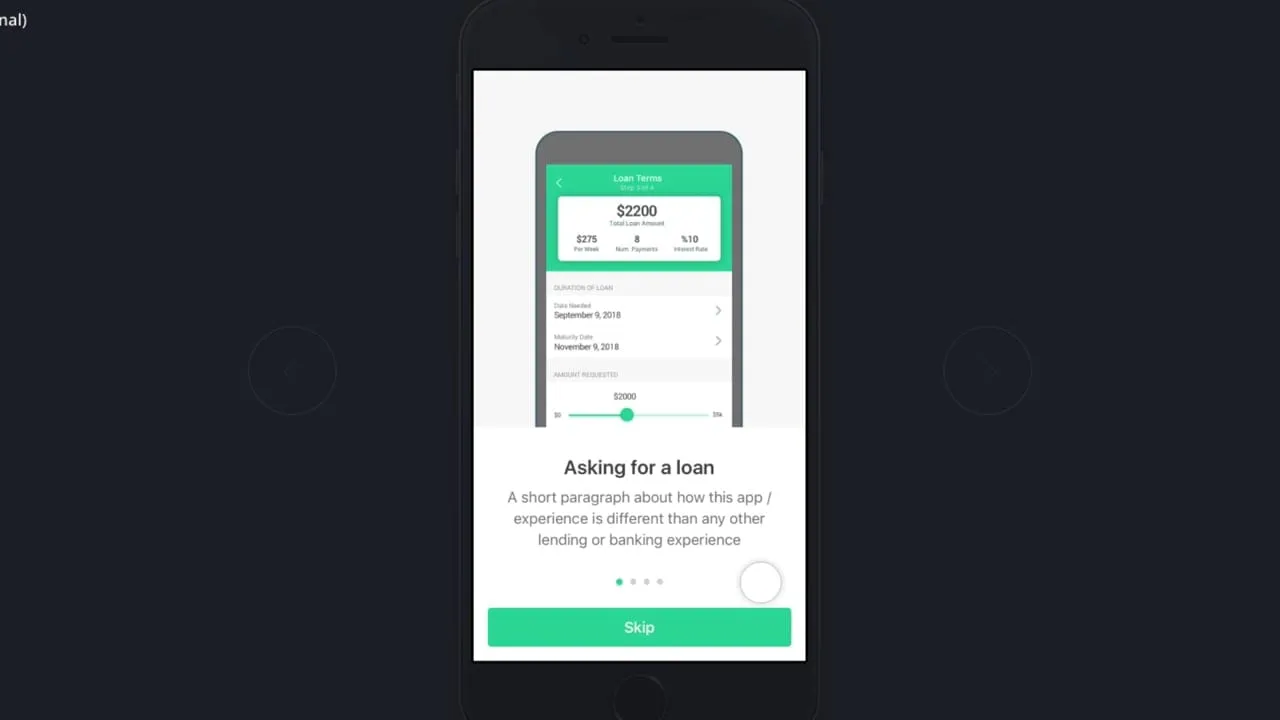
The final mockups went to full fidelity in green. The proposal flow ran in numbered steps, from naming the loan and setting terms to choosing recipients. Notifications carried the status of money moving and requests for identity documents. Those states came from working with a payment partner that handled processing and risk.
Final mockups at full fidelity. - 05
The dashboard
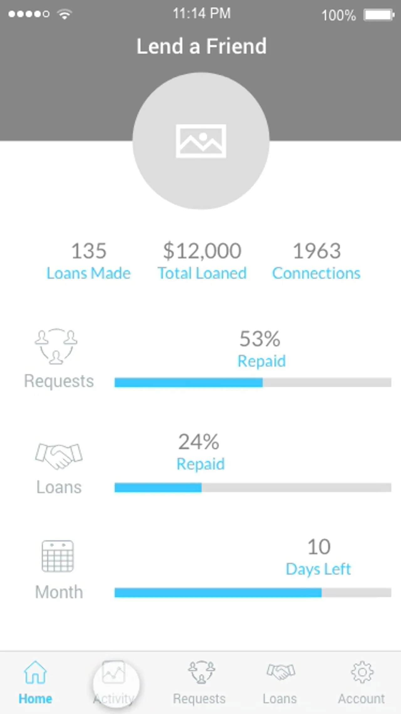
The home screen is a dashboard. A total loaned figure sits at the top in the brand green, with outstanding balance, interest earned, rating, average loan and total loans in a grid under it. Each loan below has a photo, a title and who lent to whom. I kept it plain so the numbers read first.
The Lend a Friend dashboard. - 06
Branding, motion and demo
I also did the branding and the motion graphics, and I recorded a demo of the MVP walking through the flow end to end. The demo gave the founders something to send to partners and to people they hoped would back the product, in place of a pile of static screens.
Besides screens, the founders needed something to hand around. Branding, motion and a recorded walkthrough were packaged so they could show the product to partners and possible backers.
The solution
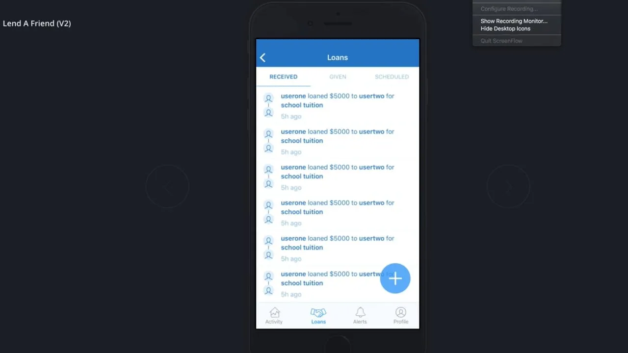
The MVP lets someone sign up, build a small circle of friends and ask for a loan with a title, a note, a photo and terms. A friend sees the proposal, reads the schedule and accepts or declines it. After that, each loan has its own page with transactions and a chat. When a loan matures, the borrower can rate the person they dealt with.
The design idea was to put the terms in front of everyone at every step. Amount, rate, frequency and dates appear in a summary card at the top of each loan screen, so neither side has to ask what was agreed. The social parts, such as photos and ratings, sit around that card and never replace it.
Decisions along the way
Build it in the room
The first prototype was built during a four-hour online session while the founders watched, so a screen they rejected could be changed before the session moved on.
Wireframes in blue
The wireframes were blue so nobody mistook them for finished design, which kept feedback on the flow.
Terms on every loan screen
Amount, rate, frequency and dates sit in a summary card at the top of each loan screen, so neither side has to ask what was agreed.
The partner's states in the design
Notifications carry the status of money moving and requests for identity documents, the states that came from working with a payment partner that handled processing and risk.
What I delivered
- Four-hour working session and first conceptual prototype
- User flow diagram of the full product
- Wireframe collection
- Full-fidelity mockups
- Branding and motion graphics
- Recorded MVP demo
See it working
Value added
For people using it
Borrowers and lenders could see the amount, rate and schedule before they agreed, and talk about it in a chat tied to the loan. Asking a friend for money followed a short, guided form.
For the business
The founders had a branded, working MVP design and a recorded demo to show partners and backers. The design also showed where the payment partner's processing and risk checks surfaced for the user.
For the team
The user flow diagram gave the founders and developers one map of the product. Wireframes and full-fidelity screens followed the same structure, which kept the build and the design in step.
By the numbers
Adults with an account, Latin America and the Caribbean
Share of adults 15 and older with an account at a financial institution or a mobile money provider, by Global Findex survey year.
View as table
| Period | Value |
|---|---|
| 2011 | 39.5% |
| 2014 | 52% |
| 2017 | 55.2% |
| 2021 | 73.5% |
Source: World Bank, Global Findex Database (indicator FX.OWN.TOTL.ZS) (opens in a new tab)
The result
Delivered the first MVP design: a user flow diagram, wireframes, full-fidelity mockups and a recorded demo. Lend-a-Friend is a live product.
What I took from it
On an early-stage product, drawing the whole flow on one page before any screens keeps founders from debating features one at a time. I would start there again. I would also put the loan terms into the very first prototype next time, since they turned out to be the center of the app.
Background
Lend-a-Friend was built for Central and South America, where many adults have had no account at a bank. World Bank Global Findex data shows account ownership in Latin America and the Caribbean rising from 39.5 percent of adults in 2011 to 73.5 percent in 2021, and the World Bank called the 18-point rise after 2017 the largest of any developing region. Payments ran through Dwolla, which describes itself as a payments layer for bank transfers.