21 / Connected device
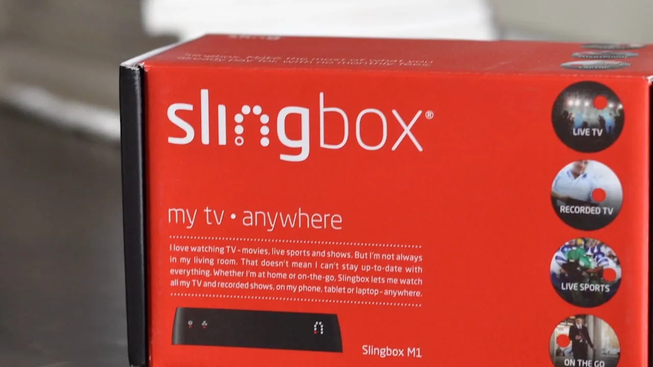
Slingbox M1
The problem
A Slingbox takes a live cable or satellite signal, including DVRs and other connected boxes, and sends it to any device anywhere through the cloud. The idea is easy to explain. Getting there was harder. Before anyone could watch a game from a laptop, they had to get a small box on their home network, and most people had never configured a device like that.
Setup was a stated goal of the M1, and the product was also getting native desktop clients for Windows and Mac, so streaming no longer had to happen in a browser. That meant a new player to design, and it had to work for a first-time owner and for someone who just wanted to change the channel. Management also needed concepts they could react to early.
The network made the player harder still. A Slingbox streams over whatever connection the viewer has, so the same box can stream well on home Wi-Fi and poorly on a phone network. The player had to stay usable when the picture was poor, and show people why.
The approach
I worked next to the internal product and UX teams, moving between concepts, setup, the desktop player and prototypes as each one needed an answer.
- 01
Product concepts
I started by developing new concepts for the product and putting them in front of upper management in presentations. I kept each concept to one clear idea and a few frames, so the conversation was about direction and priorities. Those discussions set what the setup flow and the desktop player had to do.
How the work began. Short concepts went to upper management first, and those discussions set what the setup flow and the desktop player had to do. - 02
Finding the Slingbox
Setup began with the first thing a new owner has to do: join the box's own Wi-Fi network. I wrote that as one plain instruction with the network name highlighted, and put a live list of networks under it with the right one selected. People could see what they were looking for before they went to the phone settings.
Network setup on phone and tablet. - 03
Connecting with WPS
For the connection itself I designed a WPS path as two numbered steps: press the button on the back of the Slingbox, then press the button on the router once the red light blinks. A small picture of the port and the light sits beside each step. A Test Connection button closes the flow, on phone and tablet alike.
Setup using WPS. - 04
The player framework
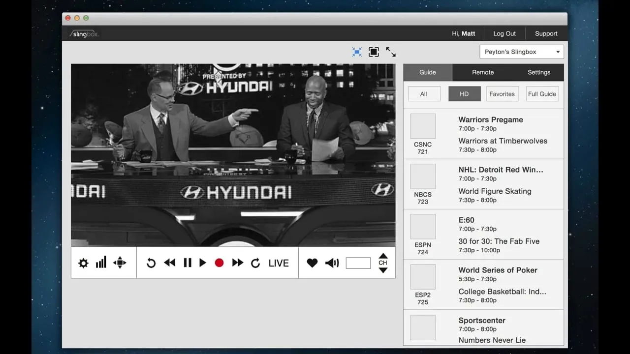
For the desktop player I wireframed the layout before drawing any controls. The window had an info bar, window controls, the video, transport controls under it, secondary controls under those, and a sidebar. Fixing those zones first gave engineering and the UX team a shared map to argue over, and gave each later feature an obvious place.
SlingPlayer layout framework. - 05
Transport controls
I drew the controls as one set on a single sheet. The main bar holds playback, record, favorite and channel. Settings, quality, remote and volume each open their own bar, and the icon of the open one turns blue. Drawing them together let me check that sizes, spacing and states matched across every bar.
Transport controls. - 06
Prototypes and visual design
I built HTML prototypes to test how the player behaved, then finished the visual interfaces in a dark, low-glare palette so the video stayed the brightest thing on screen. The sidebar holds the channel guide and the remote. A row of channel tiles runs under the controls, and the sidebar can be closed to leave just the video.
The player with the sidebar closed.
The solution
The M1 shipped with a setup flow that works from a phone or a tablet and a desktop player that fits one layout. Owners find the Slingbox on Wi-Fi, connect with WPS by following two numbered steps, and test the connection. In the player, the video sits at the center with transport controls below it, and the guide and remote live in a sidebar on the right.
The idea that held it together was a fixed set of zones. Every control had one home, whether it was the info bar, the transport bar, the secondary controls or the sidebar. Because of that, the main bar could stay short and each of the other bars could stay focused on a single task.
Decisions along the way
Setup first
Hardware is judged in the first ten minutes, so setup came before the player: one plain instruction to join the box's own Wi-Fi, then two numbered WPS steps with a picture of each button and light.
Fixed zones before controls
The desktop player was wireframed as zones first, info bar, video, transport controls, secondary controls and sidebar, so every later feature had an obvious place to go.
Every control on one sheet
The main bar and each secondary bar were drawn together, with the open bar's icon turning blue. Sizes, spacing and states could be checked across all of them before build, including a bandwidth bar that says when the connection is poor.
Video is the brightest thing
The finished player uses a dark, low-glare palette, and the sidebar with the guide and the remote can close to leave just the picture.
What I delivered
- New product concepts and management presentations
- Phone and tablet setup flow, including WPS
- SlingPlayer desktop layout framework
- Transport control set and states
- HTML prototypes
- Finished visual interfaces
See it working
Value added
For people using it
A new owner got a short, numbered path from the box to a working connection, with pictures of the buttons and lights they had to find. Once streaming, the player kept playback and channel controls in one familiar bar.
For the business
Setup was a stated goal of the M1. A simpler flow and a clear desktop player gave Sling Media a product it could explain and demonstrate, and concepts management could react to early.
For the team
The layout framework and control sheet gave engineering and the internal UX team a shared reference. Prototypes let people try the behavior before it was built, which cut down on guessing in review.
By the numbers
The result
Delivered product concepts, a simpler setup flow for phone and tablet, the SlingPlayer layout framework, transport controls and HTML prototypes.
What I took from it
Hardware products are judged in the first ten minutes, so I would start with setup again and give it the same care as the main screen. I would also keep drawing control sets together on one sheet. Inconsistencies show up there before they get built.
Background
Sling Media announced the Slingbox M1 on July 15, 2014. TechCrunch reported a $150 price, built-in Wi-Fi and new native Windows and Mac desktop clients, which meant streaming no longer had to happen in a browser. Setup was a stated goal of the product. Sling Media was founded in 2004, and EchoStar agreed to buy it in September 2007 for about $380 million. Engadget's review of the M1 found setup simple: hold the WPS button until the light blinks, then follow the app. It was the first Slingbox that could be set up from the mobile app, and the free PC and Mac players worked without a web browser.