15 / Mobile
Salesforce Mobile
The problem
Marketers who run email, SMS and social campaigns do not stay at their desks. They sit in meetings, travel to events and field questions from executives who want to know whether a send went out. Marketing Cloud lived on the desktop, so the answer to a simple question meant opening a laptop.
The mobile app had to answer those questions quickly on a small screen. That is harder than it sounds with campaign data. A send has a status, a schedule, an audience and a pile of metrics, and Marketing Cloud also spans email, Customer Journeys, automation tasks and multimedia campaigns. I was the lead designer on the whole thing, so I had to decide what a phone should show first and what it should leave out.
The app was also going to ship on iOS and Android, and two builds that drifted apart would double the cost of every later change. The layout had to be settled once, and written down precisely enough that engineers on both platforms could build the same screen from the same numbers.
Success meant a marketer could glance at the phone between meetings and know whether today's sends had gone out and how yesterday's were doing, and that each platform's app felt like the same product.
How I worked
I worked full time as lead for both interaction and visual design, starting from user and marketing research and drawing flows before screens.
- 01
Mapping Send Email
I began with the most ambitious idea, sending an email from the phone, and drew it end to end: template, message, lists, exclusions, data extensions, schedule, summary and a confirmation. Laying it out on one long strip showed how many steps it needed. That helped me argue for monitoring first and creation later.
Early Send Email concept flow. - 02
Wireframing the core screens
I moved to grayscale wireframes for the screens a marketer would open daily: journeys with target against actual conversions, automation detail, the users list, the More menu and a trimmed create-email form. Staying grayscale kept review conversations on structure and priority, and kept color out of the argument until the layout held.
Highlights from wireframing. - 03
Grid and color system
Before moving to final visuals I set up a layout system: one small block, a grid that divides evenly across the screen width, and a short palette built around Salesforce Blue with a single red for callouts. Every screen then used the same spacing, which kept iOS and Android builds close to each other.
Layout grid and color palette. - 04
Onboarding and in-app messaging
The calendar and the swipe gestures were easy to miss, so I drew first-run tips as small dark callouts pinned to the thing they explain. One says how to refresh, another how to pause a send by swiping. Each has a single Got it button, so the tip is easy to dismiss and does not block the work.
Onboarding and in-app messaging concepts. - 05
Motion graphics
I also made the motion pieces: a splash video, tooltips, UI animations and animated data visualizations. Motion carried real information in places where a static chart was hard to read at phone size. I kept it short and tied it to what had just changed, so a number moving told you the data was live.
Frames from the motion graphics work. - 06
Final visual design
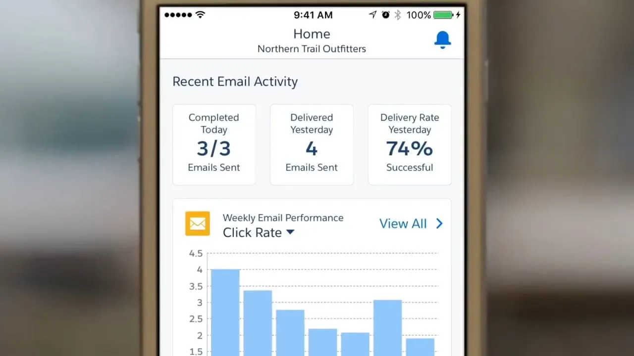
The final screens covered the home dashboard, Customer Journeys and email tracking. I annotated the home dashboard with spacing and type notes for engineering, using Salesforce Lightning Design System styles. The annotated sheet gave developers measurements for both platforms without a separate meeting for each screen.
Home dashboard with design notes.
The solution
The finished app opens on a home dashboard with the day's scheduled sends, yesterday's delivery rate and a click-rate chart that switches between metrics. A calendar shows past and upcoming messages by day. Separate sections cover email, Customer Journeys and automations, each with its own performance view. It shipped on iOS and Android.
The key idea was to make the phone a place to check and react, not to build. Everything on the home screen answers a question a marketer asks between meetings. Details sit one tap deeper, and the only quick actions I added were ones that matter in the moment, such as pausing a send in progress.
Decisions along the way
Monitoring first, creation later
I drew Send Email end to end on one long strip, from template to confirmation. Seeing every step at once made the case for a phone app that checks and reacts first, and leaves building a campaign to the desktop.
Grayscale until the layout held
The core screens stayed in grayscale through review, so the conversation stayed on structure and priority. Color came in only after the layout stopped changing.
One grid for both platforms
One small block, a grid that divides evenly across the screen, and a short palette around Salesforce Blue with a single red for callouts. Every screen used the same spacing, which kept the iOS and Android builds close.
Tips pinned to what they explain
The swipe to pause a send and the pull to refresh were easy to miss, so first-run tips sit next to the thing they describe, each with a single Got it button that gets out of the way.
What I delivered
- iOS and Android Marketing Cloud mobile app design
- Send Email concept flow and wireframes
- Layout grid and color system
- Onboarding and in-app messaging concepts
- Splash video, tooltips and UI animations
- Annotated final screens and demo video
See it working
Value added
For people using it
Marketers could see what was scheduled, check how a send or journey was doing and pause an email in progress from their phone, without waiting until they were back at a desktop.
For the business
Marketing Cloud gained a mobile presence on both major platforms. Customers could stay close to live campaigns outside the office, and the product could show executives and marketers a current view of results in meetings.
For the team
A shared grid, a small palette and annotated screens gave design and engineering the same reference for both platforms. That cut down on pixel-level questions during build and kept the iOS and Android versions close.
By the numbers
Marketing Cloud subscription revenue
Salesforce's reported subscription and support revenue for Marketing Cloud, the product line the app served. Fiscal years end January 31. These are company figures, not results of the app.
View as table
| Period | Value | Note |
|---|---|---|
| FY2015 | $505.3M | |
| FY2016 | $654.1M | |
| FY2017 | $933.3M | The filing attributes about 11% of this to the Demandware acquisition |
Source: Salesforce Form 10-K, fiscal 2017 (opens in a new tab)
The result
The app shipped on iOS and Android, with a calendar, performance tracking for email, Customer Journeys, automation tasks and multimedia campaigns, and a set of motion designs.
What I took from it
Drawing the full Send Email flow first, then deliberately not building it, was the best use of early time. On the next mobile project I would make that cut earlier and show the long flow to stakeholders as the reason.
Background
Marketing Cloud grew through Salesforce's purchase of ExactTarget, a cloud marketing platform founded in 2000 that served more than 6,000 companies. Salesforce agreed to buy it in June 2013 for about $2.5 billion, saying the deal would speed up its Marketing Cloud. Coverage of Salesforce's Connections conference in May 2016 described the first Marketing Cloud mobile app: a way for marketers to follow the performance of emails, campaigns and Customer Journeys away from their desks, and to switch between brands.